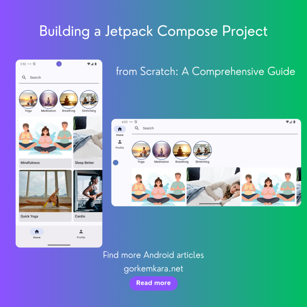
Jetpack Compose is Android’s modern toolkit for building native UIs. With the shift from XML layouts to Kotlin-based UI code, developers are empowered to build declarative and responsive UI components. This guide will help you create a complete Compose-based project step-by-step. We’ll build a responsive layout, manage state effectively, navigate between screens, and test our UI components.
The Basics of Jetpack Compose
Before diving into the code, it’s essential to understand some key concepts in Jetpack Compose, especially if you’re transitioning from XML-based layouts:
- Composable Functions: These are Kotlin functions that return UI elements. You define UI by creating composable functions instead of writing XML.
- State Management: Jetpack Compose uses state to control how UI elements are displayed. A change in state re-renders the affected composable.
- Modifiers: These are powerful tools that allow you to alter the layout, behavior, and appearance of a composable.
For a deeper understanding of these concepts, you can explore the official Jetpack Compose tutorial.
See this project on github. (Please support us by giving stars ❤️)
Check out my other sample projects here
Step 1: Project Setup
First things first, you need to set up your project in Android Studio. Make sure to use the latest version of Android Studio and include the necessary Compose dependencies in your build.gradle file.
    // build.gradle (app level)
    dependencies {
        implementation "androidx.compose.ui:ui:1.0.5"
        implementation "androidx.compose.material3:material3:1.0.0-alpha03"
        implementation "androidx.compose.ui:ui-tooling-preview:1.0.5"
        implementation "androidx.navigation:navigation-compose:2.4.0-beta01"
        implementation "androidx.lifecycle:lifecycle-runtime-ktx:2.4.0"
        // other dependencies...
    }
By adding these dependencies, you’re including the necessary Compose libraries to start building UI components and handle navigation between screens. For more details on the dependencies and their use, refer to the Compose Setup Guide.
Step 2: Creating a Theme
Every app has a theme, and Jetpack Compose offers a clean way to apply styles and colors globally. For Compose, you define themes using Kotlin code rather than XML. This is done using the MaterialTheme composable.
Example:
    @Composable
    fun MyAppTheme(content: @Composable () -> Unit) {
        MaterialTheme(
            colorScheme = lightColorScheme(
                primary = Color(0xFF6200EA),
                onPrimary = Color.White,
                background = Color(0xFFF5F5F5),
                surface = Color(0xFFFFFFFF),
                onSurface = Color.Black
            ),
            typography = Typography,
            content = content
        )
    }
The MaterialTheme composable wraps the whole app content and ensures a consistent look and feel throughout the app. The color scheme is customizable, and you can define typography to match your brand. Learn more about theming in Compose by visiting the Theming Documentation.
Step 3: Creating a Home Screen Layout
The Home screen will be the primary screen for our app. This is where we’ll introduce various Compose elements like columns, text fields, and lazy grids. Here’s how we structure our home screen layout:
HomeScreen Composable
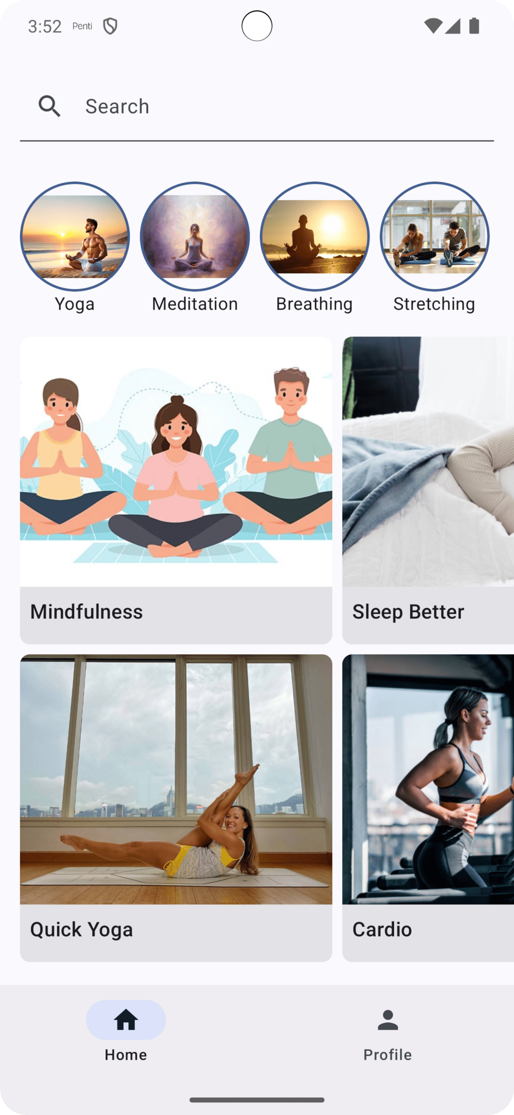
We’ll create a HomeScreen composable function to serve as the entry point of our app. This composable will include a search bar, a category row, and a grid of featured collections. Let’s look at the code:
    @Composable
    fun HomeScreen(modifier: Modifier = Modifier) {
        Column(
            modifier = modifier
                .verticalScroll(rememberScrollState())
                .padding(bottom = 56.dp)
        ) {
            var query by remember { mutableStateOf("") }
            SearchBar(
                query = query,
                onQueryChanged = { query = it }
            )
            Spacer(modifier = Modifier.height(16.dp))
            CategoryRow()
            Spacer(modifier = Modifier.height(16.dp))
            FeaturedCollectionsGrid()
        }
    }
Explanation:
Column: This composable arranges its children in a vertical sequence.rememberScrollState(): This enables vertical scrolling within the column, so the content can be scrolled if it overflows the screen height.var query by remember { mutableStateOf("") }: This sets up a state variable to store the search query.Spacer: Adds spacing between elements.
Step 4: Creating a Search Bar

The search bar is an essential UI component in many apps. Let’s build it using Compose:
    @Composable
    fun SearchBar(
        query: String,
        onQueryChanged: (String) -> Unit,
        modifier: Modifier = Modifier
    ) {
        TextField(
            value = query,
            onValueChange = onQueryChanged,
            leadingIcon = {
                Icon(Icons.Default.Search, contentDescription = "Search")
            },
            placeholder = {
                Text(text = "Search")
            },
            modifier = modifier
                .fillMaxWidth()
                .padding(8.dp)
        )
    }
Explanation:
TextField: A composable for taking user input. It displays the search query and updates when the user types.leadingIcon: Adds an icon to the left of the input field.placeholder: Placeholder text displayed when the field is empty.
TextField in Compose is highly customizable and supports many functionalities. For further details, you can refer to the TextField Documentation.
Step 5: Displaying Featured Collections as a Lazy Grid
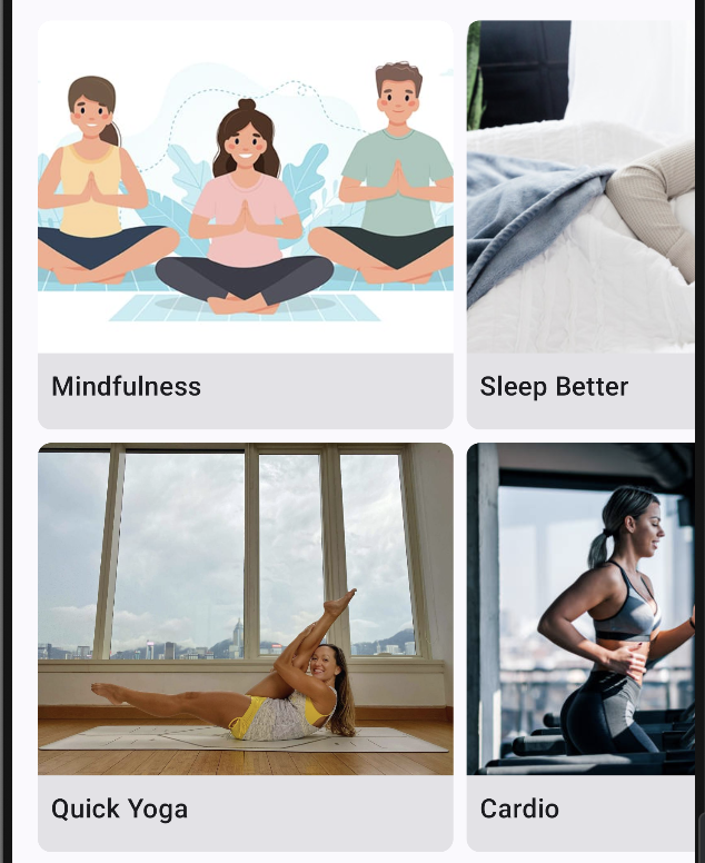
The Featured Collections Grid will display a set of collections dynamically. You can use LazyHorizontalGrid to create a performant grid layout:
    @Composable
    fun FeaturedCollectionsGrid(modifier: Modifier = Modifier) {
        LazyHorizontalGrid(
            rows = GridCells.Fixed(2),
            contentPadding = PaddingValues(horizontal = 16.dp),
            horizontalArrangement = Arrangement.spacedBy(8.dp),
            verticalArrangement = Arrangement.spacedBy(8.dp),
            modifier = modifier.height(500.dp)
        ) {
            items(
                count = featuredCollections.size,
                itemContent = { index ->
                    val collection = featuredCollections[index]
                    Card(
                        shape = RoundedCornerShape(8.dp),
                        modifier = Modifier.fillMaxSize()
                    ) {
                        Column {
                            Image(
                                painter = painterResource(collection.imageRes),
                                contentDescription = collection.title,
                                modifier = Modifier.size(height = 200.dp, width = 250.dp),
                                contentScale = ContentScale.Crop
                            )
                            Text(
                                text = collection.title,
                                style = MaterialTheme.typography.titleMedium,
                                modifier = Modifier.padding(8.dp)
                            )
                        }
                    }
                }
            )
        }
    }
Explanation:
LazyHorizontalGrid: A performant grid that renders items lazily. Only the visible items are rendered on the screen.Card: A Material container that groups the grid’s content together.Image: Loads and displays the drawable resource for each collection item.
To better understand lazy loading in Compose, check out the Lazy Layout Documentation.
Step 6: Navigation in Compose
Navigation is a key feature in any app. With Compose, we use NavController and NavHost to handle screen transitions. Here’s an example of setting up navigation:
    @Composable
    fun MyAppNavHost(navController: NavController) {
        NavHost(navController = navController, startDestination = "home") {
            composable("home") { HomeScreen() }
            composable("profile") { ProfileScreen() }
        }
    }
Explanation:
NavController: Responsible for handling navigation actions within your app.NavHost: Defines the navigation graph, which is the set of screens (composables) and actions (navigation events) in your app.
Step 7: Testing in Jetpack Compose
Jetpack Compose allows you to write UI tests with ease. You can use createComposeRule to create a test environment for your composables. Here’s an example of testing our HomeScreen:
    @RunWith(AndroidJUnit4::class)
    class HomeScreenTest {
        @get:Rule
        val composeTestRule = createComposeRule()

        @Test
        fun searchBar_displaysCorrectPlaceholder() {
            composeTestRule.setContent {
                SearchBar(query = "", onQueryChanged = {})
            }

            composeTestRule
                .onNodeWithText("Search")
                .assertExists()
        }
    }
Explanation:
composeTestRule: Sets up the Compose testing environment.onNodeWithText("Search"): Finds the text node with the text “Search” and asserts its existence.
For more testing options and best practices in Compose, visit the Testing in Compose Documentation.
Conclusion
By following this guide, you’ve learned how to build a simple yet powerful Jetpack Compose app. We’ve covered fundamental concepts like creating a theme, laying out components, and navigating between screens. Compose makes UI development much easier and more flexible compared to XML, letting you manage state effectively and write more readable code.
To see the complete project code, visit the GitHub repository: FlowWell GitHub Repository.
For more information and guidance, check out the official Jetpack Compose documentation.