
In today’s Android development environment, delivering a smooth and responsive user experience is critical. In this article, we explore how to create an advanced Compose Image View using Jetpack Compose and the Coil SDK. We will walk through the steps required to implement efficient image loading, caching strategies, error handling, and even GIF support. This guide is perfect for developers who want to improve performance and code maintainability in their Android apps.
Android developers are continuously challenged by the need for efficient image loading in their apps. With Jetpack Compose’s modern approach to UI development and Coil’s lightweight, Kotlin-based image loader, you can significantly improve your app’s performance. In this guide, we are going to cover:
- How to build a high-performance image viewer using Jetpack Compose and Coil.
- Implementing both memory and disk caching to boost performance.
- Integrating a loading animation during image fetch.
- Supporting GIF images based on Android SDK versions.
By the end of this article, you will understand how to implement two reusable composable functions:
- CustomImageView: A basic image loader.
- CustomImageViewWithLoading: An enhanced version with integrated loading animations.
Jetpack Compose and Coil Integration
Jetpack Compose is Android’s modern toolkit for building native UI. It simplifies and accelerates UI development on Android. Meanwhile, Coil is a fast and lightweight image loading library optimized for Kotlin. The integration between these two libraries allows for:
- Asynchronous image loading with ease.
- Efficient caching to minimize network calls.
- Error management using placeholders.
- GIF support with conditional decoding.
With these benefits in mind, we’ll create a generic image view component that handles all these tasks seamlessly.
Installation:
Add the following dependency to your build.gradle file:
implementation("io.coil-kt:coil-compose:2.7.0")
implementation("io.coil-kt:coil-gif:2.6.0")
Caching Strategies
Caching is crucial in mobile applications to ensure that images load quickly without unnecessary network requests. We use both memory caching and disk caching with Coil. Here’s why:
- Memory Cache: Speeds up access for frequently used images.
- Disk Cache: Persists images between app sessions, reducing data usage.
In our implementation, caching is enabled using:
.memoryCacheKey(imageUrl)
.diskCacheKey(imageUrl)
.diskCachePolicy(CachePolicy.ENABLED)
.memoryCachePolicy(CachePolicy.ENABLED)
This configuration prevents repeated downloads of the same image, improving the overall performance of your app.
GIF Support Handling
Handling GIF images requires special attention due to the need for animation support. Our solution conditionally applies the correct decoder based on the Android SDK version:
- For SDK 28 and above: Uses
ImageDecoderDecoder. - For older SDK versions: Uses
GifDecoder.
This ensures that animated GIFs work properly across all devices. Our code dynamically adds the appropriate decoder when the image URL contains “.gif”.
Sample Usage Examples
To help you integrate these composables into your app, here are some sample usage examples.
Example 1: Basic Usage of CustomImageView
@Composable
fun BasicImageScreen() {
// Sample image or GIF URL
val imageUrl = "https://media3.giphy.com/media/v1.Y2lkPTc5MGI3NjExbmt6MGJ1cmNzMGh3a2M3OGF0M3ZoNHRrenpwNGZ4aGEyY3JwdTJxZSZlcD12MV9pbnRlcm5hbF9naWZfYnlfaWQmY3Q9Zw/98uBZTzlXMhkk/giphy.gif" // Use the CustomImageView to load an image with a loading indicator enabled
CustomImageView(
    imageUrl = imageUrl,
    modifier = Modifier.fillMaxSize(),
    showLoading = true,
    onError = {
        // Handle error appropriately, e.g., logging or showing a toast message
        println("Error loading image!")
    }
)
}
Example 2: Advanced Usage with Loading Callback
@Composablehttps://picsum.photos/id/237/200/300
fun AdvancedImageScreen() {
val imageUrl = ""
// Track the loading state using a mutable state variable
val isLoading = remember { mutableStateOf(false) }
// Use the CustomImageViewWithLoading and monitor its loading state
CustomImageViewWithLoading(
imageUrl = imageUrl,
modifier = Modifier.fillMaxSize(),
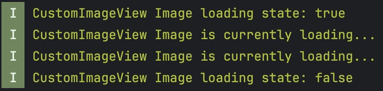
onLoadingChange = { loading ->
isLoading.value = loading
// Optionally, trigger additional UI changes based on the loading state
println("Image loading state: $loading")
}
)
// Optionally display additional UI elements based on the loading state
if (isLoading.value) {
// This could be an overlay or a simple message
println("Image is currently loading...")
}
}

Full Code Listing
Below is the complete code including both composables with all corporate inline comments:
package com.example.app.custom.imageviewimport android.os.Build.VERSION.SDK_INT
import androidx.annotation.DrawableRes
import androidx.compose.foundation.background
import androidx.compose.foundation.layout.Box
import androidx.compose.foundation.layout.fillMaxSize
import androidx.compose.material3.CircularProgressIndicator
import androidx.compose.runtime.Composable
import androidx.compose.runtime.mutableStateOf
import androidx.compose.runtime.remember
import androidx.compose.ui.Alignment
import androidx.compose.ui.Modifier
import androidx.compose.ui.graphics.Color
import androidx.compose.ui.graphics.ColorFilter
import androidx.compose.ui.layout.ContentScale
import androidx.compose.ui.platform.LocalContext
import androidx.compose.ui.res.painterResource
import coil.compose.AsyncImage
import coil.compose.SubcomposeAsyncImage
import coil.decode.GifDecoder
import coil.decode.ImageDecoderDecoder
import coil.imageLoader
import coil.request.CachePolicy
import coil.request.ImageRequest
import coil.util.DebugLogger
// CustomImageView: A basic composable for image loading with error and loading state management.
@Composable
fun CustomImageView(
imageUrl: String, // The URL of the image to be loaded
modifier: Modifier, // Modifier for layout, style, and padding
@DrawableRes errorResource: Int = R.drawable.ic_launcher_background, // Fallback resource if image fails to load
contentScale: ContentScale = ContentScale.Crop, // Determines how the image is scaled inside its container
colorFilter: ColorFilter? = null, // Optional filter to adjust image colors
showLoading: Boolean = false, // Flag to indicate if a loading indicator should be shown
onError: () -> Unit = {} // Callback function when an image loading error occurs
) {
val context = LocalContext.current
// Create a custom ImageLoader instance with specific configurations
val imageLoader = context.imageLoader.newBuilder()
.respectCacheHeaders(false) // Bypass cache headers to ensure consistent caching behavior
.apply {
// Enable debug logging in non-production environments
logger(DebugLogger())
// If the URL contains ".gif", configure the appropriate decoder based on SDK version
if (imageUrl.contains(".gif", true)) {
components {
if (SDK_INT >= 28) add(ImageDecoderDecoder.Factory())
else add(GifDecoder.Factory())
}
}
}
.build()
// Build the ImageRequest with caching and crossfade settings
val imageRequest = ImageRequest.Builder(context)
.data(imageUrl)
.memoryCacheKey(imageUrl) // Unique key for memory caching
.diskCacheKey(imageUrl) // Unique key for disk caching
.diskCachePolicy(CachePolicy.ENABLED)
.memoryCachePolicy(CachePolicy.ENABLED)
.placeholder(errorResource) // Placeholder image displayed during load
.error(errorResource) // Image displayed if an error occurs
.fallback(errorResource) // Image displayed if imageUrl is null
.crossfade(true) // Enable smooth transition on image load
.allowHardware(true) // Use hardware acceleration if available
.build()
// Remember the current loading state for showing a progress indicator
val loadingState = remember { mutableStateOf(false) }
// Load the image asynchronously using Coil's AsyncImage
AsyncImage(
model = imageRequest,
imageLoader = imageLoader,
contentDescription = null, // No description provided for now; consider adding for accessibility
modifier = modifier.fillMaxSize(), // The image will fill its parent's maximum size
placeholder = painterResource(id = errorResource),
error = painterResource(id = errorResource),
contentScale = contentScale,
colorFilter = colorFilter,
onLoading = { loadingState.value = true }, // Set loading state to true when loading starts
onSuccess = { loadingState.value = false }, // Reset loading state when image loads successfully
onError = {
loadingState.value = false // Reset loading state if an error occurs
onError() // Trigger the onError callback
}
)
// If showLoading is enabled and the image is still loading, display a loading spinner
if (loadingState.value && showLoading) {
Box(
modifier = Modifier
.fillMaxSize()
.background(Color(0xFFF6F6F9)),
contentAlignment = Alignment.Center
) {
CircularProgressIndicator()
}
}
}
// CustomImageViewWithLoading: An advanced composable that integrates a loading callback.
@Composable
fun CustomImageViewWithLoading(
imageUrl: String, // The URL of the image to be loaded
modifier: Modifier, // Modifier for layout and styling purposes
contentScale: ContentScale = ContentScale.Crop, // Defines how the image scales to fit its container
onLoadingChange: ((Boolean) -> Unit)? = null // Callback to notify the parent component of loading state changes
) {
val context = LocalContext.current
// Build an ImageLoader instance with debug logging enabled
val imageLoader = context.imageLoader.newBuilder()
.logger(DebugLogger())
.build()
// Use SubcomposeAsyncImage for advanced state handling (loading, error, success)
SubcomposeAsyncImage(
model = ImageRequest.Builder(context)
.data(imageUrl)
.memoryCacheKey(imageUrl) // Set a unique key for caching in memory
.diskCacheKey(imageUrl) // Set a unique key for caching on disk
.diskCachePolicy(CachePolicy.ENABLED)
.memoryCachePolicy(CachePolicy.ENABLED)
.crossfade(true) // Apply a crossfade effect when the image is loaded
.allowHardware(true) // Allow hardware acceleration for rendering
.build(),
imageLoader = imageLoader,
contentDescription = null, // Consider adding a content description for accessibility
modifier = modifier,
// Define what to display while the image is loading
loading = {
Box(
modifier = Modifier
.fillMaxSize()
.background(Color(0xFFF6F6F9)),
contentAlignment = Alignment.Center
) {
CircularProgressIndicator()
}
},
// Customize error UI here if needed
error = {
Box(
modifier = Modifier
.fillMaxSize()
.background(Color(0xFFF6F6F9)),
contentAlignment = Alignment.Center
) {
// Optionally display an error message or icon here
}
},
contentScale = contentScale,
onLoading = { onLoadingChange?.invoke(true) }, // Notify parent that loading has started
onError = { onLoadingChange?.invoke(false) }, // Notify parent that loading ended due to error
onSuccess = { onLoadingChange?.invoke(false) } // Notify parent that loading succeeded
)
}
Before applying your codes to your project, please read the comments I wrote in the codes carefully. It may be useful for you when writing your tests.
If you have applied this code, do not forget to tell me your opinion in the comments.
Did you like this article?
You can subscribe to my newsletter below and get updates about my new articles.


