
Kotlin Multiplatform Mobile (KMM) allows you to share code between Android and iOS. We’ll create a basic login app using Jetpack Compose and demonstrate how to set up a KMM project from scratch. By the end, you’ll understand how to create a login screen, navigate between screens with a bottom navigation bar, and structure your project effectively.
If you are new to KMM, check out this guide for more insights on how it enables cross-platform development: Kotlin Multiplatform Mobile – Cross Platform Development.
Setting Up Your Kotlin Multiplatform Mobile Project
1. Installing the KMM Plugin for Android Studio
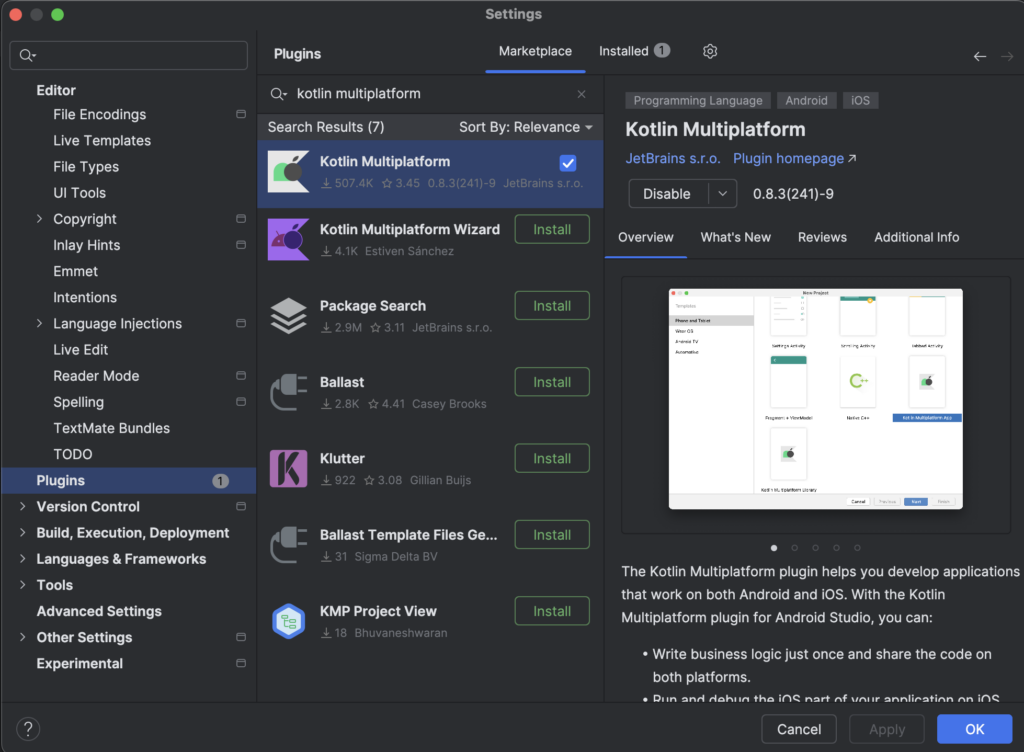
Before starting, ensure you have the KMM Plugin installed in Android Studio. Go to Preferences > Plugins, search for Kotlin Multiplatform Mobile, and install it.
2. Creating a New KMM Project
- Open Android Studio and go to Settings. Find the Plugins tab. Type “kotlin multiplatform” in the search field in the Marketplace tab, download the plugin, activate it, close Android Studio and restart it.
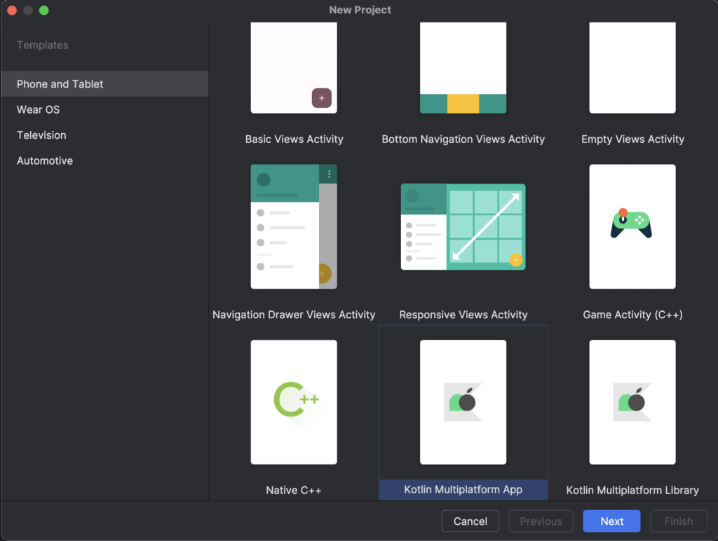
- In Android Studio, click on File > New > New Project.
- Select Kotlin Multiplatform App from the project templates.
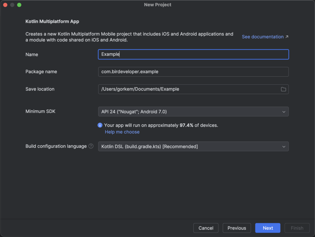
- Provide a Project Name, Package Name, and Project Location.
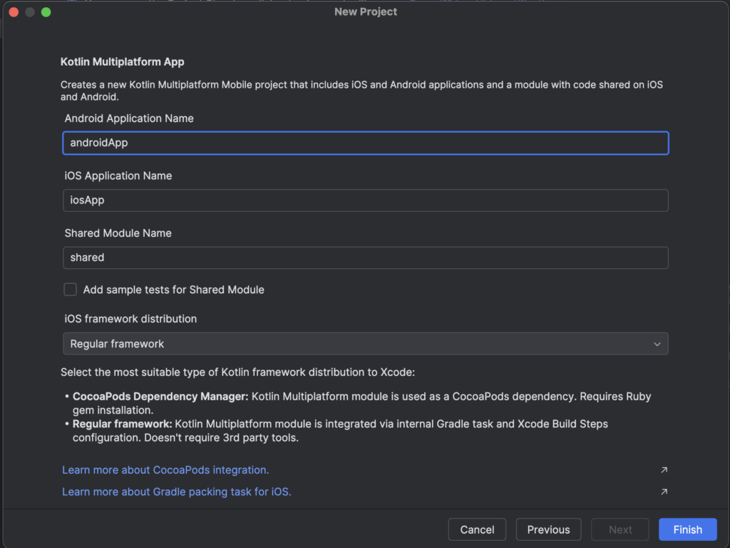
- Choose Android and iOS as your target platforms and finish the setup.
a
Once the project is created, you’ll have a structure similar to this:
- androidApp: Contains Android-specific code and AndroidManifest.
- iosApp: Contains iOS-specific code (Xcode project).
- shared: The shared module with Kotlin code that can be used across Android and iOS.
Project Structure and Organization
Shared Module Structure
The shared module is where the core business logic of your app resides. Under src/commonMain/kotlin, you can create shared code that will be reused by both platforms.
Adding the UI Package Structure
Let’s add the following packages under src/commonMain/kotlin to organize our screens and navigation logic:
- ui: Contains all the UI composables (screens).
- screens: Each screen has its own composable.
- LoginScreen.kt
- HomeScreen.kt
- ProductListScreen.kt
- ProfileScreen.kt
- navigation: Handles navigation between different screens.
- screens: Each screen has its own composable.
- viewmodel: Optional, if you are using ViewModels for managing state across the screens.
Setting Up Dependencies in build.gradle.kts
Open your build.gradle.kts file in the shared module and add dependencies for Jetpack Compose and Kotlinx Serialization (if needed). Ensure you have the following configurations:
kotlin {
    androidTarget {
        compilations.all {
            kotlinOptions {
                jvmTarget = "1.8"
            }
        }
    }

    listOf(
        iosX64(),
        iosArm64(),
        iosSimulatorArm64()
    ).forEach {
        it.binaries.framework {
            baseName = "shared"
            isStatic = true
        }
    }

    sourceSets {
        commonMain.dependencies {
            implementation("org.jetbrains.kotlinx:kotlinx-serialization-core:1.6.3")
            implementation("org.jetbrains.compose.runtime:runtime:1.6.11")
            implementation("org.jetbrains.compose.ui:ui:1.6.11")
            implementation("org.jetbrains.compose.foundation:foundation:1.6.11")
            implementation("org.jetbrains.compose.material:material:1.6.11")
            implementation("androidx.navigation:navigation-compose:2.8.1")
        }
        commonTest.dependencies {
            implementation(libs.kotlin.test)
        }
    }
}
This ensures your project is set up to use Jetpack Compose and Material Design components across both Android and iOS.
Implementing the Screens
1. Login Screen
Create a LoginScreen.kt file under ui/screens. This screen will contain two text fields (username and password) and a login button. Upon successful login, it navigates to the Home screen.
@Composable
fun LoginScreen(onLoginSuccess: () -> Unit) {
    var username by remember { mutableStateOf("") }
    var password by remember { mutableStateOf("") }

    Column(
        modifier = Modifier.fillMaxSize().padding(16.dp),
        verticalArrangement = Arrangement.Center,
        horizontalAlignment = Alignment.CenterHorizontally
    ) {
        TextField(
            value = username,
            onValueChange = { username = it },
            label = { Text("Username") }
        )

        Spacer(modifier = Modifier.height(16.dp))

        TextField(
            value = password,
            onValueChange = { password = it },
            label = { Text("Password") },
            visualTransformation = PasswordVisualTransformation()
        )

        Spacer(modifier = Modifier.height(24.dp))

        Button(onClick = {
            if (username == "user" && password == "password") {
                onLoginSuccess()
            }
        }) {
            Text("Login")
        }
    }
}
2. Home Screen with Bottom Navigation
Create a HomeScreen.kt file under ui/screens. This screen will use a Scaffold from Material Design to include a bottom navigation bar for switching between Product List and Profile screens.
@Composable
fun HomeScreen() {
    val navController = rememberNavController()
    Scaffold(
        bottomBar = {
            BottomNavigation {
                BottomNavigationItem(
                    icon = { Icon(Icons.Default.Home, contentDescription = "Products") },
                    label = { Text("Products") },
                    selected = true,
                    onClick = { navController.navigate("products") }
                )
                BottomNavigationItem(
                    icon = { Icon(Icons.Default.Person, contentDescription = "Profile") },
                    label = { Text("Profile") },
                    selected = false,
                    onClick = { navController.navigate("profile") }
                )
            }
        }
    ) {
        NavHost(navController, startDestination = "products") {
            composable("products") { ProductListScreen() }
            composable("profile") { ProfileScreen() }
        }
    }
}
The Scaffold composable provides a flexible structure for implementing Material Design layouts in your Compose screens. Learn more about its uses: Jetpack Compose Material Documentation.
3. Product List Screen
Create a ProductListScreen.kt file under ui/screens. We’ll use a LazyColumn to display a simple list of products.
@Composable
fun ProductListScreen() {
    val products = listOf("Product 1", "Product 2", "Product 3")

    LazyColumn(modifier = Modifier.fillMaxSize().padding(16.dp)) {
        items(products) { product ->
            Card(
                modifier = Modifier.fillMaxWidth().padding(8.dp),
                elevation = 4.dp
            ) {
                Text(
                    text = product,
                    modifier = Modifier.padding(16.dp),
                    style = MaterialTheme.typography.h6
                )
            }
        }
    }
}
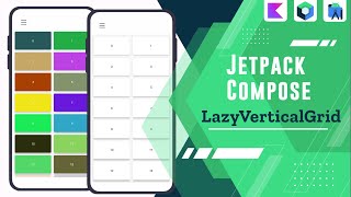
LazyColumn is great for rendering large lists efficiently. If you need more advanced grid-based layouts, explore Jetpack Compose LazyVerticalGrid.
4. Profile Screen
Create a ProfileScreen.kt file under ui/screens. This screen will display a dummy profile picture and name.
@Composable
fun ProfileScreen() {
    Column(
        modifier = Modifier.fillMaxSize().padding(16.dp),
        verticalArrangement = Arrangement.Center,
        horizontalAlignment = Alignment.CenterHorizontally
    ) {
        Image(
            painter = painterResource(id = R.drawable.ic_profile_placeholder),
            contentDescription = "Profile Picture",
            modifier = Modifier.size(128.dp).clip(CircleShape)
        )

        Spacer(modifier = Modifier.height(16.dp))

        Text(text = "Görkem KARA", style = MaterialTheme.typography.h5)
    }
}
The Image composable is used here to display a circular profile picture, while the Text composable shows the user’s name in a heading style.
Navigation and State Management
Managing the state across different screens is essential in KMM projects. Using remember and MutableState ensures a consistent user experience. If you’re interested in managing state effectively in Compose, check out: State Management in Android Compose: MutableState & remember.
Conclusion
With Jetpack Compose Multiplatform, you can efficiently create a cross-platform application with reusable UI components and a consistent codebase. By using Material Design components, managing state effectively, and structuring your project well, you can create a powerful and intuitive user interface for both Android and iOS.
Stay tuned for more articles that will cover advanced Jetpack Compose techniques and best practices for Kotlin Multiplatform Mobile development!
Did you like this article?
You can subscribe to my newsletter below and get updates about my new articles.


