With Material3, Jetpack Compose provides updated components and APIs, offering more design flexibility and user-friendly interfaces. One of these enhanced components is the ModalBottomSheet, which makes it easy to present dynamic bottom sheet content. In this article, we will delve into using the ModalBottomSheet in Jetpack Compose, focusing on the Material3 library.
What is ModalBottomSheet in Material3?
The ModalBottomSheet in Material3 is a powerful composable that provides a modal interface at the bottom of the screen, allowing for additional content or actions without disrupting the main UI. We will walk through how to customize and implement it effectively using Material3 components.
Key Parameters of ModalBottomSheet in Material3
The ModalBottomSheet component offers various parameters to tailor the bottom sheet’s behavior and appearance. Here’s a breakdown of the core parameters:
- onDismissRequest: () -> Unit: Triggered when the user tries to dismiss the bottom sheet, such as by tapping outside the sheet or swiping down.
- sheetState: ModalBottomSheetState: Controls the current state of the bottom sheet (hidden, expanded, or partially expanded).
- scrimColor: Color: Sets the overlay color when the bottom sheet is active.
- modifier: Modifier: Provides modifications to the appearance and behavior.
Basic Usage of ModalBottomSheet in Material3
Let’s implement a simple ModalBottomSheet using Material3. To start, you’ll need to set up the state using rememberModalBottomSheetState:
@OptIn(ExperimentalMaterial3Api::class)
@Composable
fun SimpleModalBottomSheet() {
val sheetState = rememberModalBottomSheetState()
val coroutineScope = rememberCoroutineScope()
var showBottomSheet by remember { mutableStateOf(false) }
Scaffold(
floatingActionButton = {
ExtendedFloatingActionButton(
text = { Text("Show bottom sheet") },
icon = { Icon(Icons.Filled.Add, contentDescription = null) },
onClick = { showBottomSheet = true }
)
}
) { contentPadding ->
// Main screen content
Column(
modifier = Modifier
.fillMaxSize()
.padding(contentPadding),
verticalArrangement = Arrangement.Center,
horizontalAlignment = Alignment.CenterHorizontally
) {
Text(text = "Main Screen Content")
}
// Show bottom sheet
if (showBottomSheet) {
ModalBottomSheet(
onDismissRequest = { showBottomSheet = false },
sheetState = sheetState
) {
// Sheet content
Column(
modifier = Modifier.padding(16.dp)
) {
Text(text = "Hello from Bottom Sheet!")
Button(onClick = {
coroutineScope.launch { sheetState.hide() }
.invokeOnCompletion {
showBottomSheet = false
}
}) {
Text(text = "Hide Bottom Sheet")
}
}
}
}
}
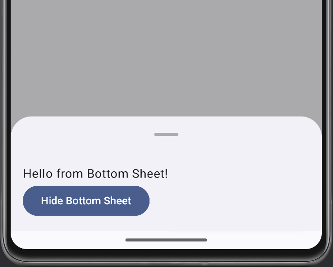
}Explanation: The bottom sheet appears when showBottomSheet is set to true. The onDismissRequest parameter handles hiding the sheet, and you can close it by clicking the button within the sheet.
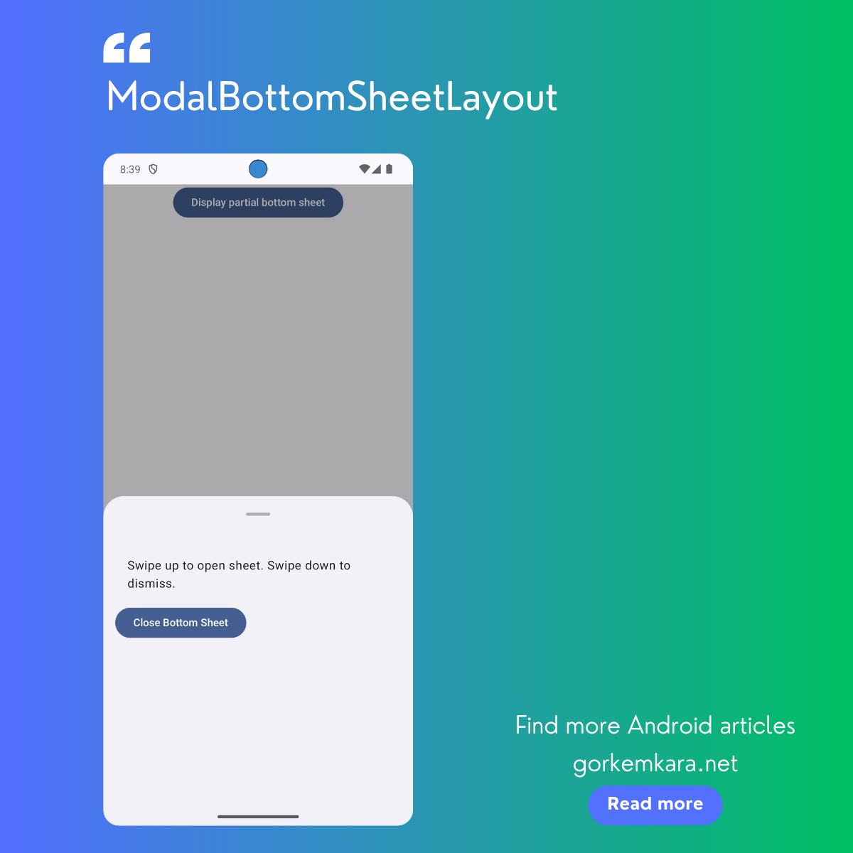
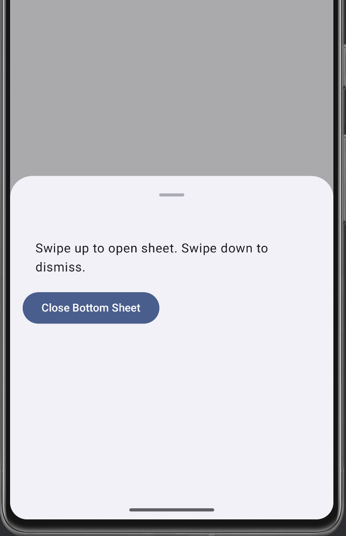
Partial Expansion in ModalBottomSheet
In some cases, you may want the bottom sheet to be partially expanded, allowing users to swipe up to fully expand it. This behavior can be achieved using the skipPartiallyExpanded parameter.
@OptIn(ExperimentalMaterial3Api::class)
@Composable
fun PartialBottomSheet() {
    val sheetState = rememberModalBottomSheetState(
        skipPartiallyExpanded = false
    )
    var showBottomSheet by remember { mutableStateOf(false) }

    Column(
        modifier = Modifier.fillMaxWidth(),
        horizontalAlignment = Alignment.CenterHorizontally,
    ) {
        Button(
            onClick = { showBottomSheet = true }
        ) {
            Text("Display partial bottom sheet")
        }

        if (showBottomSheet) {
            ModalBottomSheet(
                modifier = Modifier.fillMaxHeight(),
                sheetState = sheetState,
                onDismissRequest = { showBottomSheet = false }
            ) {
                // Sheet content
                Column(
                    modifier = Modifier.padding(16.dp)
                ) {
                    Text(
                        "Swipe up to open sheet. Swipe down to dismiss.",
                        modifier = Modifier.padding(16.dp)
                    )
                    Button(onClick = {
                        showBottomSheet = false
                    }) {
                        Text("Close Bottom Sheet")
                    }
                }
            }
        }
    }
}
Explanation: This example uses skipPartiallyExpanded to allow the sheet to start in a partially expanded state, enabling swipe gestures to expand or collapse it.
Customizing the Appearance of the Bottom Sheet
The ModalBottomSheet offers extensive customization options for modifying its look and feel. Here are some examples demonstrating how you can enhance its design:
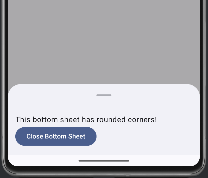
1. Rounded Corners Bottom Sheet
Add rounded corners to your bottom sheet for a modern design:
@OptIn(ExperimentalMaterial3Api::class)
@Composable
fun RoundedCornerBottomSheet() {
val sheetState = rememberModalBottomSheetState()
var showBottomSheet by remember { mutableStateOf(false) }
val coroutineScope = rememberCoroutineScope()
Column(
modifier = Modifier.fillMaxWidth(),
horizontalAlignment = Alignment.CenterHorizontally,
) {
Button(onClick = { showBottomSheet = true }) {
Text("Open Rounded Corner Sheet")
}
if (showBottomSheet) {
ModalBottomSheet(
onDismissRequest = { showBottomSheet = false },
sheetState = sheetState
) {
// Sheet content
Column(
modifier = Modifier
.fillMaxWidth()
.padding(16.dp)
.clip(RoundedCornerShape(topStart = 16.dp, topEnd = 16.dp))
) {
Text(text = "This bottom sheet has rounded corners!")
Button(onClick = {
coroutineScope.launch { sheetState.hide() }
.invokeOnCompletion {
showBottomSheet = false
}
}) {
Text("Close Bottom Sheet")
}
}
}
}
}
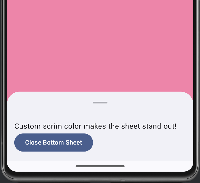
}2. Custom Scrim Color
Change the scrim color for a unique overlay effect when the sheet is active:
@OptIn(ExperimentalMaterial3Api::class)
@Composable
fun CustomScrimColorBottomSheet() {
    val sheetState = rememberModalBottomSheetState()
    var showBottomSheet by remember { mutableStateOf(false) }
    val coroutineScope = rememberCoroutineScope()

    Column(
        modifier = Modifier.fillMaxWidth(),
        horizontalAlignment = Alignment.CenterHorizontally,
    ) {
        Button(onClick = { showBottomSheet = true }) {
            Text("Open Sheet with Custom Scrim")
        }

        if (showBottomSheet) {
            ModalBottomSheet(
                onDismissRequest = { showBottomSheet = false },
                sheetState = sheetState,
                scrimColor = Color(0xAAFF4081) // Pink transparent scrim
            ) {
                // Sheet content
                Column(
                    modifier = Modifier.padding(16.dp)
                ) {
                    Text(text = "Custom scrim color makes the sheet stand out!")
                    Button(onClick = {
                        coroutineScope.launch { sheetState.hide() }
                            .invokeOnCompletion {
                                showBottomSheet = false
                            }
                    }) {
                        Text("Close Bottom Sheet")
                    }
                }
            }
        }
    }
}
Testing ModalBottomSheet in Jetpack Compose (Material3)
Testing in Compose is essential for verifying the behavior of your bottom sheets. Here’s an example test for a basic bottom sheet:
@RunWith(AndroidJUnit4::class)
class ModalBottomSheetTest {
    @get:Rule
    val composeTestRule = createComposeRule()

    @Test
    fun bottomSheet_opensAndClosesCorrectly() {
        composeTestRule.setContent {
            SimpleModalBottomSheet()
        }

        // Open bottom sheet
        composeTestRule.onNodeWithText("Show bottom sheet").performClick()
        composeTestRule.onNodeWithText("Hello from Bottom Sheet!").assertExists()

        // Close bottom sheet
        composeTestRule.onNodeWithText("Hide Bottom Sheet").performClick()
        composeTestRule.onNodeWithText("Hello from Bottom Sheet!").assertDoesNotExist()
    }
}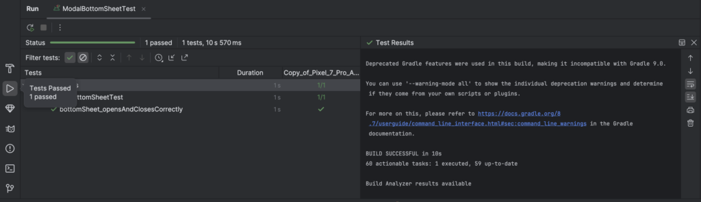
Explanation: This test simulates opening and closing the bottom sheet and verifies that the content inside the sheet is correctly displayed and hidden.
Conclusion
The ModalBottomSheet in Material3 empowers developers to build engaging, interactive components that enhance user experience. With options to partially expand, customize scrim colors, and test your sheets effectively, Jetpack Compose makes UI development intuitive and powerful. For more advanced techniques in Jetpack Compose, check out Advanced Navigation Techniques in Jetpack Compose.
Please click to see the ModalBottomSheet Example code on Github. I’m waiting for your comments.
Did you like this article?
You can subscribe to my newsletter below and get updates about my new articles.


