
Android Compose introduces powerful components for creating smooth, user-friendly interfaces. One of the essential components is the HorizontalPager, which allows developers to implement horizontal scrolling layouts with ease. In this article, we’ll cover the basics of using HorizontalPager, show how to customize it, and explore adding animations for enhanced visual appeal.
What is HorizontalPager?
The HorizontalPager component in Compose is a flexible and efficient way to create horizontally scrollable pages. Unlike a standard RecyclerView, HorizontalPager handles lazy loading of content, snapping behavior, and smooth animations, making it ideal for scenarios where you need to present content as swipeable pages.
Basic Usage of HorizontalPager
Here’s a simple example of how to implement HorizontalPager in your Compose app:
@OptIn(ExperimentalFoundationApi::class)
@Composable
fun SimpleHorizontalPager() {
val pagerState = rememberPagerState(pageCount = { 5 })
HorizontalPager(
state = pagerState,
modifier = Modifier.fillMaxWidth()
) { page ->
Box(
modifier = Modifier
.fillMaxWidth()
.height(200.dp)
.background(if (page % 2 == 0) Color.Blue else Color.Green),
contentAlignment = Alignment.Center
) {
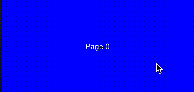
Text(text = "Page $page", color = Color.White)
}
}
}
Output: When you run this code, you’ll see a horizontally swipeable pager with five pages. The pages will alternate between blue and green backgrounds.
Customizing HorizontalPager
HorizontalPager provides several customization options to enhance your UI. Let’s explore some of these features:
Adding Padding and Spacing

Sometimes, you might want to add padding around the pages or spacing between them. You can do this by using the contentPadding and pageSpacing parameters:
@Composable
fun CustomHorizontalPager() {
    val pagerState = rememberPagerState()
    HorizontalPager(
        state = pagerState,
        count = 5,
        contentPadding = PaddingValues(horizontal = 16.dp),
        pageSpacing = 8.dp,
        modifier = Modifier.fillMaxWidth()
    ) { page ->
        Box(
            modifier = Modifier
                .fillMaxWidth(0.8f)
                .height(200.dp)
                .background(Color.Gray),
            contentAlignment = Alignment.Center
        ) {
            Text(text = "Page $page", color = Color.White)
        }
    }
}
Output: This example creates pages with padding on both sides and space between each page. The effect is more visually appealing, especially for carousel-like components.
Enabling or Disabling User Scroll
If you want to control whether users can scroll through the pages manually, use the userScrollEnabled parameter:
@Composable
fun ScrollControlPager() {
    val pagerState = rememberPagerState()
    HorizontalPager(
        state = pagerState,
        count = 3,
        userScrollEnabled = false, // Disable manual scrolling
        modifier = Modifier.fillMaxWidth()
    ) { page ->
        Text(text = "Static Page $page", modifier = Modifier.fillMaxWidth(), textAlign = TextAlign.Center)
    }
}
Output: The pager will no longer respond to user swipes but can still be controlled programmatically.
Animating HorizontalPager
Adding animations to the HorizontalPager can make transitions smoother and enhance the user experience. Let’s look at how to add some basic animations.
Creating a Fade Animation

We can create a fade effect when transitioning between pages by applying animation to the content:
@Composable
fun FadingHorizontalPager() {
    val pagerState = rememberPagerState()
    HorizontalPager(
        state = pagerState,
        count = 5,
        modifier = Modifier.fillMaxWidth()
    ) { page ->
        val alpha = remember {
            androidx.compose.animation.core.animateFloatAsState(
                targetValue = if (pagerState.currentPage == page) 1f else 0.5f
            )
        }
        Box(
            modifier = Modifier
                .fillMaxWidth()
                .height(200.dp)
                .background(Color.Blue)
                .graphicsLayer(alpha = alpha.value),
            contentAlignment = Alignment.Center
        ) {
            Text(text = "Animated Page $page", color = Color.White)
        }
    }
}
Output: The currently visible page will have full opacity, while the other pages will appear faded. This effect draws focus to the active page.
Zoom Animation on Page Change

Another interesting animation is to slightly zoom in on the current page:
@Composable
fun ZoomingHorizontalPager() {
    val pagerState = rememberPagerState()
    HorizontalPager(
        state = pagerState,
        count = 5,
        modifier = Modifier.fillMaxWidth()
    ) { page ->
        val scale = remember {
            androidx.compose.animation.core.animateFloatAsState(
                targetValue = if (pagerState.currentPage == page) 1f else 0.85f
            )
        }
        Box(
            modifier = Modifier
                .graphicsLayer(scaleX = scale.value, scaleY = scale.value)
                .fillMaxWidth()
                .height(200.dp)
                .background(Color.Red),
            contentAlignment = Alignment.Center
        ) {
            Text(text = "Zoom Page $page", color = Color.White)
        }
    }
}
Output: The current page will appear slightly larger, creating a zoom effect that enhances the focus on the active content.
Conclusion
The HorizontalPager component in Android Compose is a versatile and easy-to-use tool for creating swipeable content. With the ability to customize and animate, it provides developers with everything they need to build engaging, interactive UI components. Start integrating HorizontalPager in your projects to make your user experiences more dynamic and visually appealing.
If you’re interested in learning more about creating custom layouts in Compose, check out this detailed article on Advanced Navigation Techniques in Jetpack Compose.
Did you like this article?
You can subscribe to my newsletter below and get updates about my new articles.


How to create a horizontalpager with cards that rotate 180 degrees?
I will include this in my next compose article. Please stay tuned